My role
Product Designer
Focus
Information Architecture
Interaction Design
Design System

Most health reports are designed for clinicians, not the people receiving them. They present numbers, reference ranges, and medical terminology accurately, but rarely help someone understand what deserves attention, why it matters, or what to do next.
Our goal wasn't to redesign a report. It was to redesign the experience of receiving one by transforming complex clinical data into something people could understand without compromising medical accuracy.
Designing for preventive healthcare meant balancing two competing goals.
The experience had to simplify more than 350 biomarkers without oversimplifying the science behind them. Every decision had to reduce cognitive load while preserving enough context for users to understand their health with confidence.
This wasn't about displaying more information. It was about helping people focus on the information that mattered most.
This is where it all begins- let’s go!

Grouping biomarkers by severity helped users identify what needed attention immediately. However, it also made the experience feel overly clinical, encouraging users to focus on what was "wrong" before understanding the bigger picture.
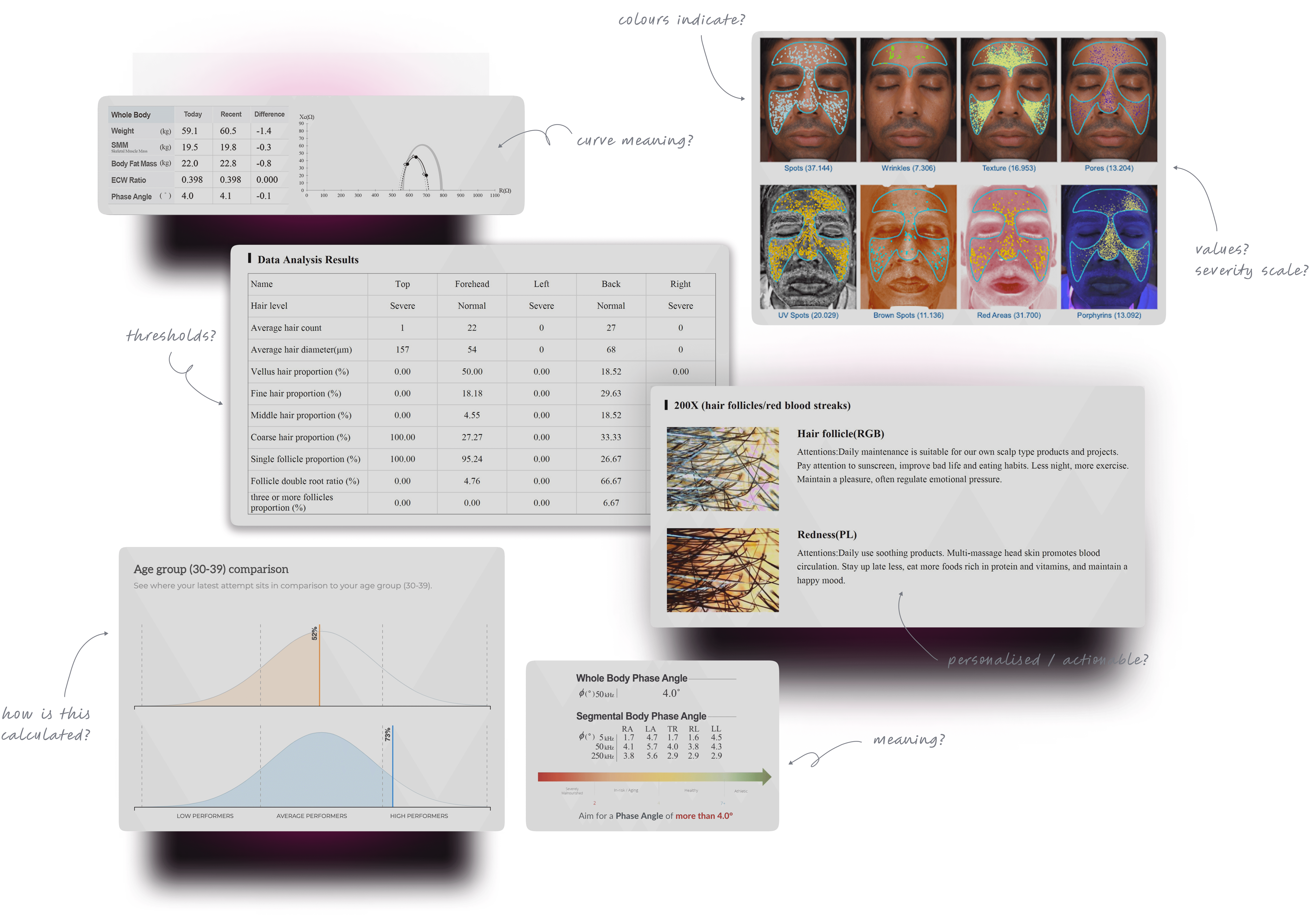

Organizing information by body systems introduced familiar mental models. Instead of seeing a list of abnormalities, users could understand how different biomarkers contributed to the health of a specific system, making the experience feel more educational than alarming.
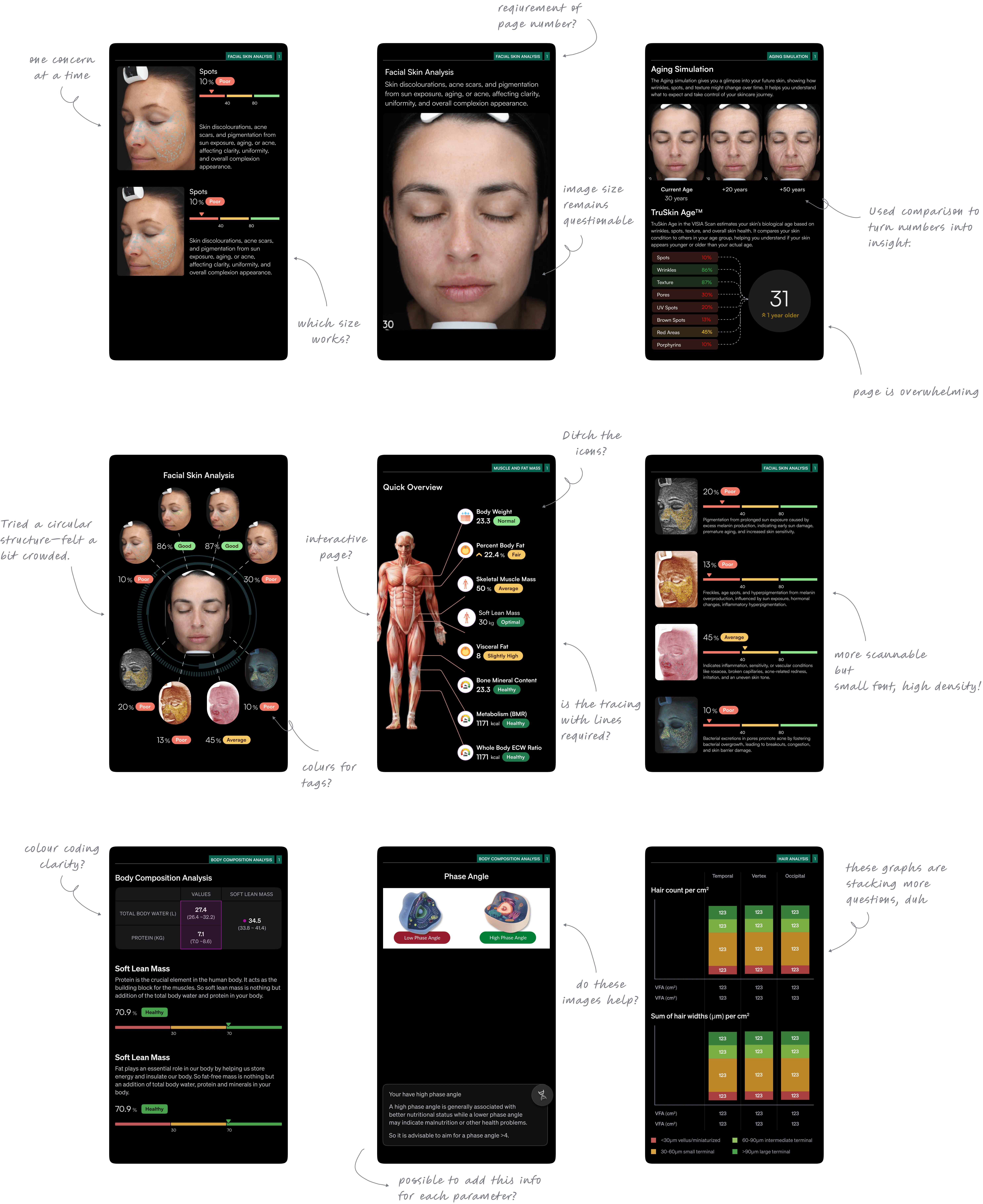
Early explorations relied heavily on range visualizations to communicate where each biomarker sat within its optimal range. While informative, repeating this pattern across hundreds of biomarkers created visual fatigue.
The challenge wasn't adding context. It was deciding where context created value and where it became noise.

The final experience prioritized understanding over completeness.
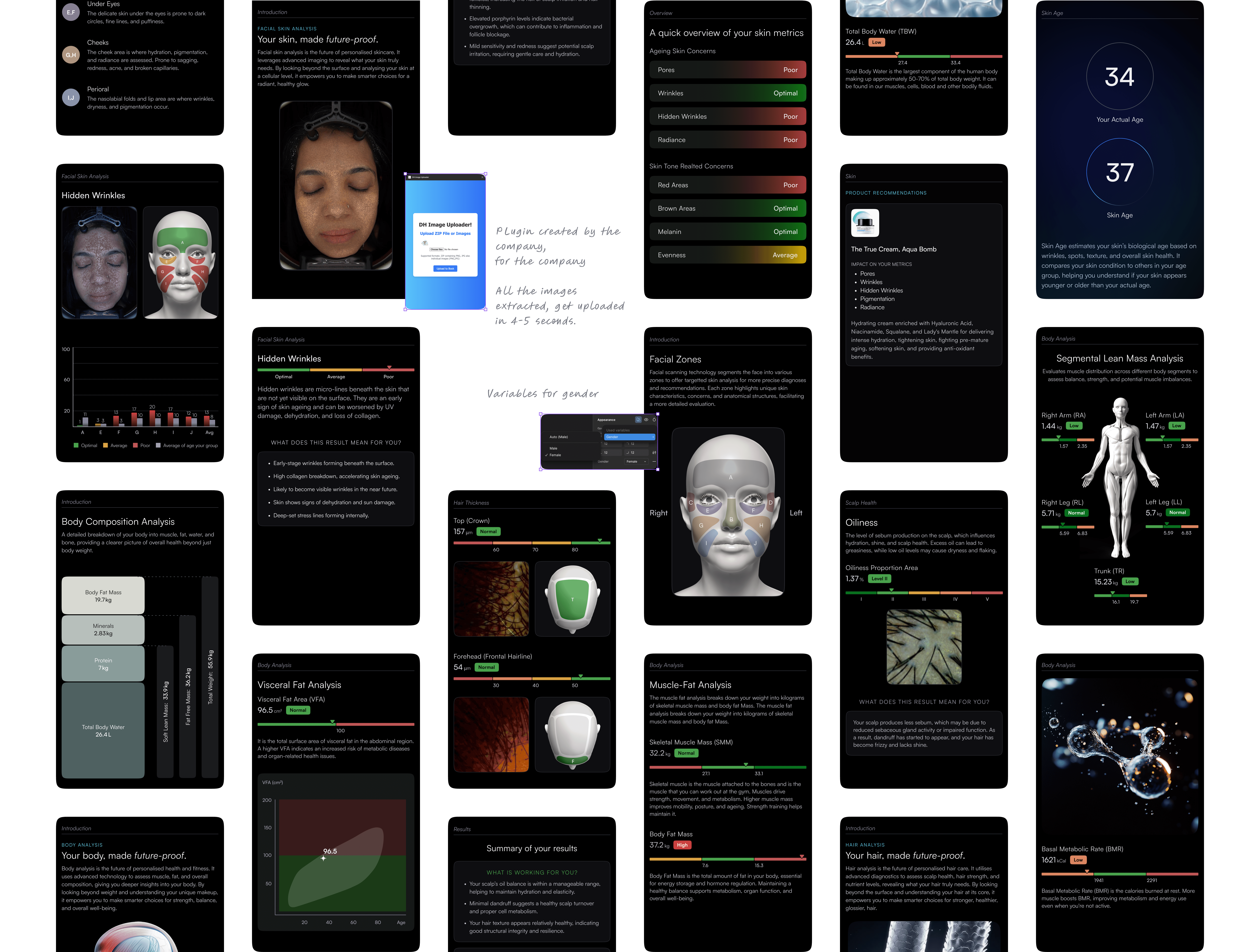
Information was grouped by body systems to provide familiar entry points, supported by visual cues that helped users identify priorities without creating unnecessary alarm. Plain-language descriptions added clinical context, helping users understand what each biomarker meant and why it mattered before speaking to a healthcare professional.
Rather than replacing expert guidance, the dashboard prepared users to have more informed conversations about their health.

~30% of users lacked a skincare routine, showing clear need- a strong opportunity for first-time engagement.
Reports were seen as accurate and helpful, reflecting real conditions.
~15% of users adopted recommended products- an encouraging start that validated user trust.