My role
Product Designer
Timeline
1.5 Days (MVP)
Imagine walking into a beauty store, completing a diagnostic scan, and receiving a 20-page report filled with graphs, percentages and medical terminology.
Most customers don't know what those numbers actually mean or what they're supposed to do next.
Our challenge wasn't to improve the scan itself.
It was to transform complex diagnostic data into a simple, actionable experience that customers could understand within minutes during a live retail launch.


Since this was an MVP, we leveraged research from a similar initiative conducted a month earlier. We spoke with existing customers, visited Kaya Skin Clinic to observe their consultation process, and analyzed how people interpreted diagnostic reports.
Rather than validating whether people wanted scans, we wanted to understand where they struggled after recieving the results.
Insight 01
Customers relied on staff to explain clinical terms, percentages, and graphs because the reports weren't designed for everyday readers.
Insight 02
The beauty market is crowded with products and conflicting advice. Customers wanted confidence that recommendations were specific to them.
Insight 03
People didn't just want to know what was happening with their skin or hair, they wanted clear next steps.

Before designing anything, we had to understand the report ourselves.
The diagnostic machines generated highly technical outputs that even our design team couldn't confidently interpret.
Designing the interface before understanding the science would have meant simplifying information we didn't yet understand.
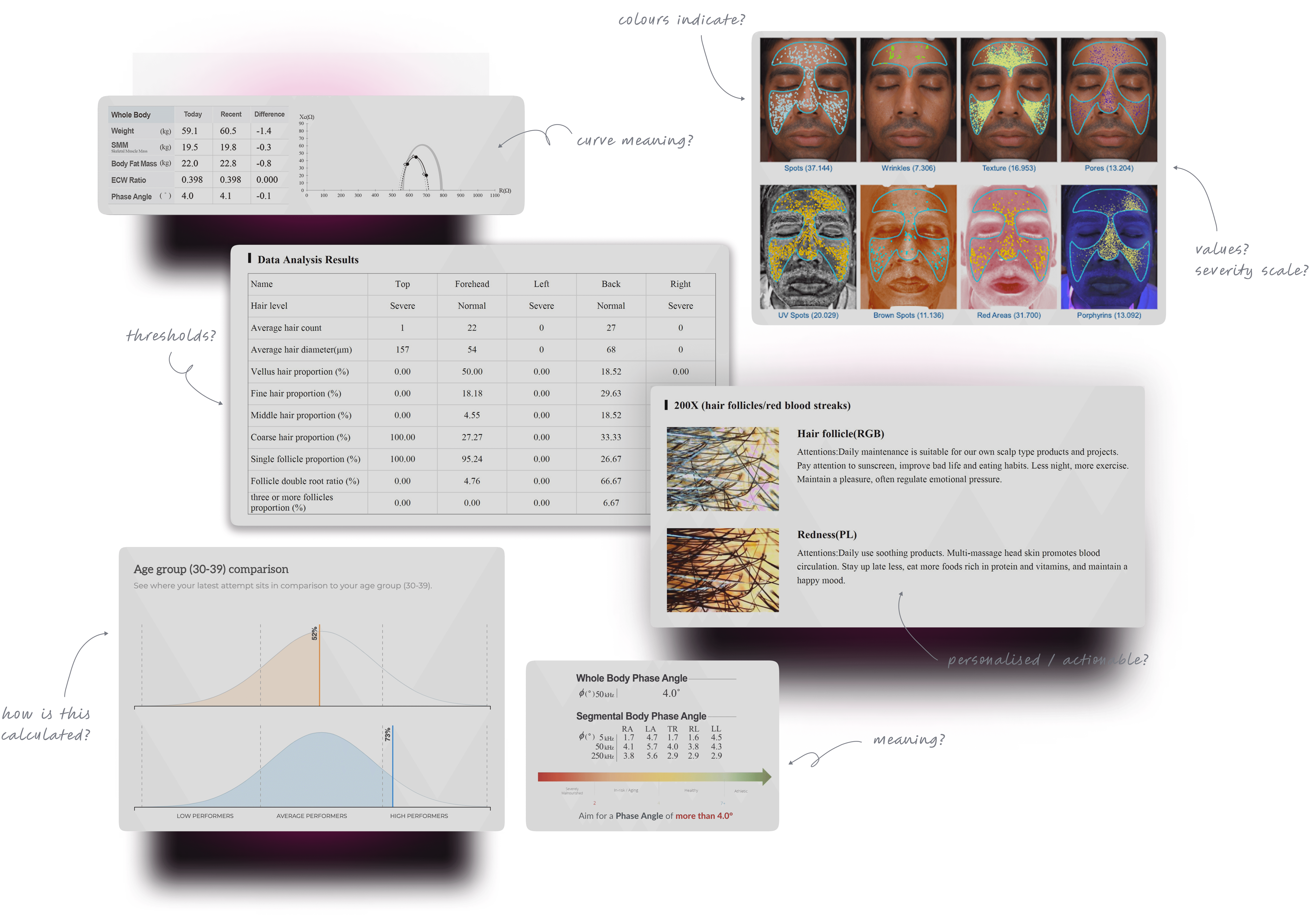
Collaborated with the machine vendor.
Interviewed doctors and wellness experts.
Broke down every parameter into plain language.
Prioritized which metrics mattered most for first-time users.
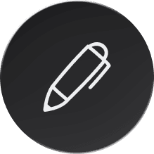
Once I understood what the data was actually meant, focus shifted on to how the user experience should be.
How to reduce anxiety?
How might we make it scannable?
How do we help users know what to do next?
Building a dashboard would have delayed the launch and increased engineering effort before we had validated demand.
Since the objective of the MVP was learning, not building a perfect product, we intentionally shipped a PDF experience first.
Designing the report was only half the challenge.
Since this experience was happening live inside a retail store, every customer's report had to be generated and delivered within minutes.
A manually populated PDF meant longer wait times, higher chances of human error, and a workflow that wouldn't scale beyond the launch weekend.
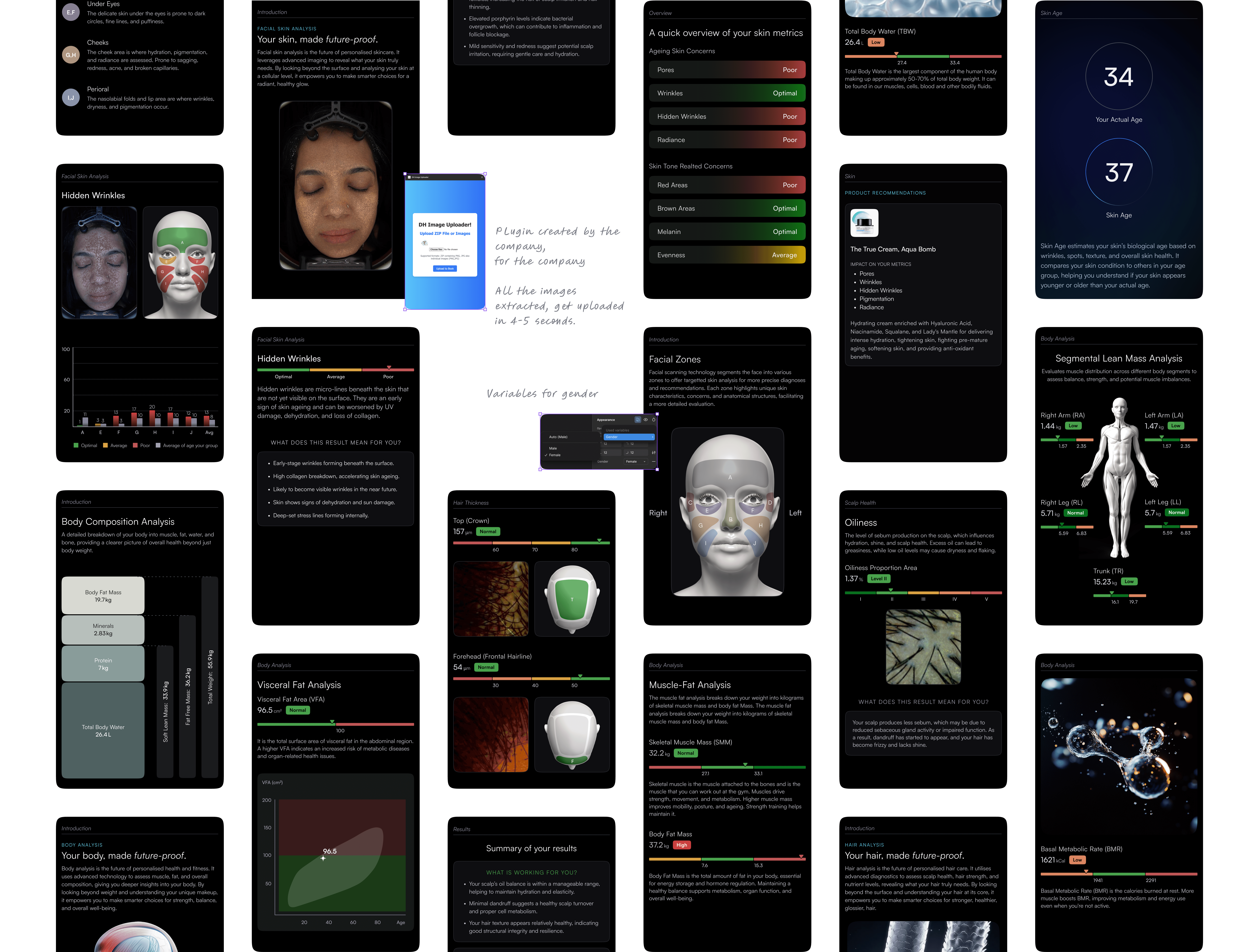
While reviewing the scan reports, I noticed that every generated PDF followed the exact same structure. Images always appeared in fixed positions, regardless of the customer.
Instead of treating each report as a unique document, I wondered if those fixed coordinates could become anchors for automation.
Step 1
Mapped every image placeholder in Figma to fixed coordinates.
Step 2
Worked with engineering to build an extraction plugin that automatically populated the correct visuals.
Step 3
Applied a similar workflow for numerical data using Google Sheets and automation.
Step 4
Tested, debugged, and refined the pipeline until reports generated reliably.

Report generation dropped from roughly 15 minutes of manual effort to around 2-3 minutes, making the live launch operationally feasible.

One fix at a time.
Reduced cognitive load and allowed users to focus on a single issue before moving to the next.
Marked facial, hair, and body zones so users could immediately identify where each result applied, reducing the effort of interpreting unfamiliar scan images.
Replaced technical terminology with simple explanations while preserving scientific meaning.
Once the launch validated user interest, the temporary PDF workflow was no longer sufficient.
The first priority after launch was transitioning the experience into a web dashboard, enabling users to access reports digitally while reducing operational overhead.

1500+ users during launch weekend
30% had no skincare routine
Reports generated excitement and repeat referrals
15% adopted recommended products
Report generation reduced from ~15 minutes → 2-3 minutes
Dashboard replaced manual workflow after MVP
Reduced manual intervention through automation
Users wanted alternative product recommendations
Retail staff occasionally recommended different products than the report
Product availability should eventually sync with recommendations

Simplifying medical information required understanding the science. Delivering the experience required designing operational workflows alongside engineering.
The biggest takeaway for me was that great product design isn't just about making interfaces intuitive, it's about reducing friction across the entire system.