My role
Product Designer
Focus
Information Architecture
Interaction Design
Data Visualization
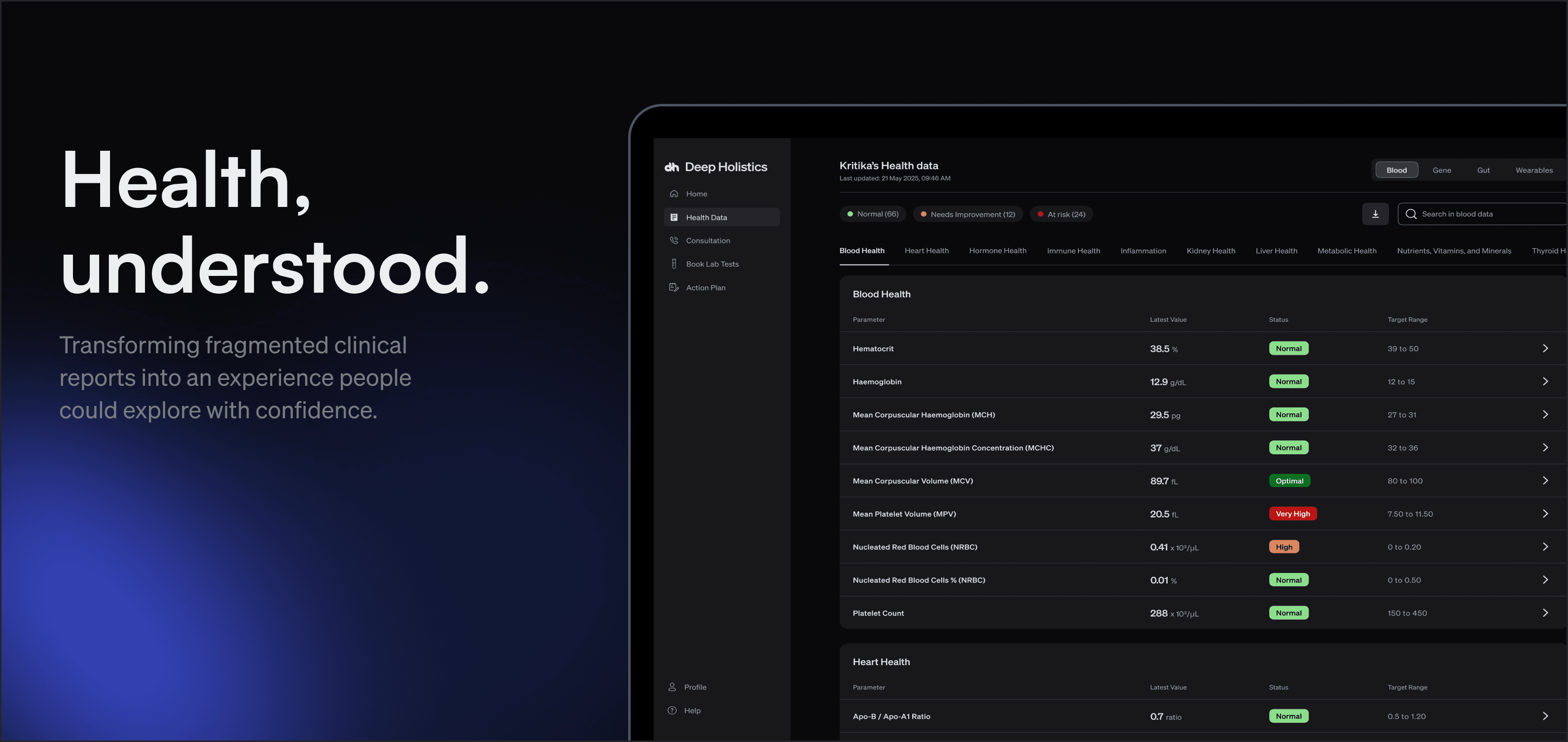
Standard report

A report designed to understand clinical findings.
What we aimed for

An experience designed to communicate undetsatnding.
Clinical reports answer what your numbers are. We wanted to help people undersatnd what they mean.
Health reports are designed to communicate clinical findings, not everyday understanding.
Most people receive their reports as PDFs over email, WhatsApp, or directly from a diagnostic lab. They contain valuable information, but interpreting it often requires medical knowledge. Even something as simple as comparing results over time means digging through old reports and manually piecing together what has changed.
We wanted to rethink that experience.
Instead of asking people to adapt to clinical reports, we asked how clinical reports could adapt to the people reading them.
That shift became the foundation for everything that followed.
How do you design an experience that helps people understand 350+ biomarkers without compromising the clinical accuracy behind them?
We needed to..

Reduce complexity

Guide attention

Simplify medical language

Show progress over time
Without..

Hiding important information
Creating unnecessary anxiety
Oversimplifying the science
Increasing cognitive load
We stopped asking how to display more health data and started asking how people make sense of it.

The challenge wasn't finding a way to display 350+ biomarkers. There are countless ways to organize information on a screen.
The real challenge was finding a mental model that felt natural to someone who wasn't a healthcare professional.
Every exploration became an attempt to answer a different question about how people understand their health.
Exploration 1
What should people notice first?

Grouped all biomarkers by status: At Risk, Needs Improvement, Optimal
Brought the most urgent findings to the top so nothing critical got buried
Made sense as a starting point. Prioritise what needs attention first
Why it didn't work
A flagged marker tells you something is off. It doesn't tell you where in the body it belongs
Seeing "LDL: High" grouped under At Risk gives you no context. Is this a heart problem? A liver problem? A kidney problem?
Without knowing which body system a marker belongs to, the information creates anxiety without understanding
Urgency without context is just alarming
Exploration 2
Should health be organized by urgency or by body system?

Shifted grouping from severity to body systems: Heart Health, Liver, Kidney, Hormonal Health, and so on
Each system showed all its markers together, regardless of status
Aligned with how people actually think about their health
Why it didn't work (FUlly)
Getting the grouping right was necessary, but not enough on its own
A status label like "Borderline High" tells you direction. It doesn't tell you how far off you are or what better would look like
Users could find the right system but still couldn't make sense of what to do with the number in front of them
Exploration 3
How much information is enough?

Added range visualisations to each biomarker row showing where the value sat within the optimal range
Gave users real context beyond just a status label
Each bar showed the full spectrum: low, optimal, borderline, high
Why it didn't work
One range bar is informative. A hundred of them in a row becomes exhausting to scroll through
At 350+ biomarkers, the same visual repeated endlessly created fatigue before users even reached the markers that mattered
Not every biomarker needs the same level of emphasis. Most people just need a verdict, not a precise position on a scale
Exploration 4
Can colour guide attention without creating anxiety?

Used colour heavily to signal status across the dashboard
Red for At Risk, amber for Needs Improvement, green for Optimal
Logical, familiar, medically recognisable
Why it didn't work
Even a small number of red markers pulled the eye disproportionately
The page felt dominated by warning states, even when the majority of results were normal
Colour was doing more talking than the data
The experience felt alarming rather than informative. We needed colour to guide attention, not amplify concern

We stopped optimizing for how much information we could display and started optimizing for how confidently someone could understand it.
Not by severity, not by status. A user needs to know what part of their body a marker belongs to before they can make sense of what the number means
A first time user needs a verdict, not a precise position on a range. Colour communicates direction without demanding interpretation
Every biomarker includes a plain language explanation, but the dashboard goes further. Three modes, Friend, Biohacker, and Doctor, let users shift the entire tone and depth of the content based on how they want to engage with their health data. Copywriting was as much a design decision as layout


The dashboard gave first time users something they didn't have before: a way to open their results and actually understand them, without needing a doctor on the phone to explain every number.
Users arrived at consultations having already explored their data, with specific questions rather than general confusion
Longevity experts could walk through results on a call without losing people to unfamiliar terminology
The three language modes meant the same dashboard worked for someone who wanted a simple verdict and someone who wanted clinical depth
a new pattern emerged as customers started returning for repeat tests.
The dashboard was built around a single result. Comparing old and new values meant digging through separate reports manually
Experts sharing their screen during consultations had no easy way to show how a marker had moved over time
The experience that worked well for a first visit didn't serve someone trying to track six months of progress

Compare, Track, Act.
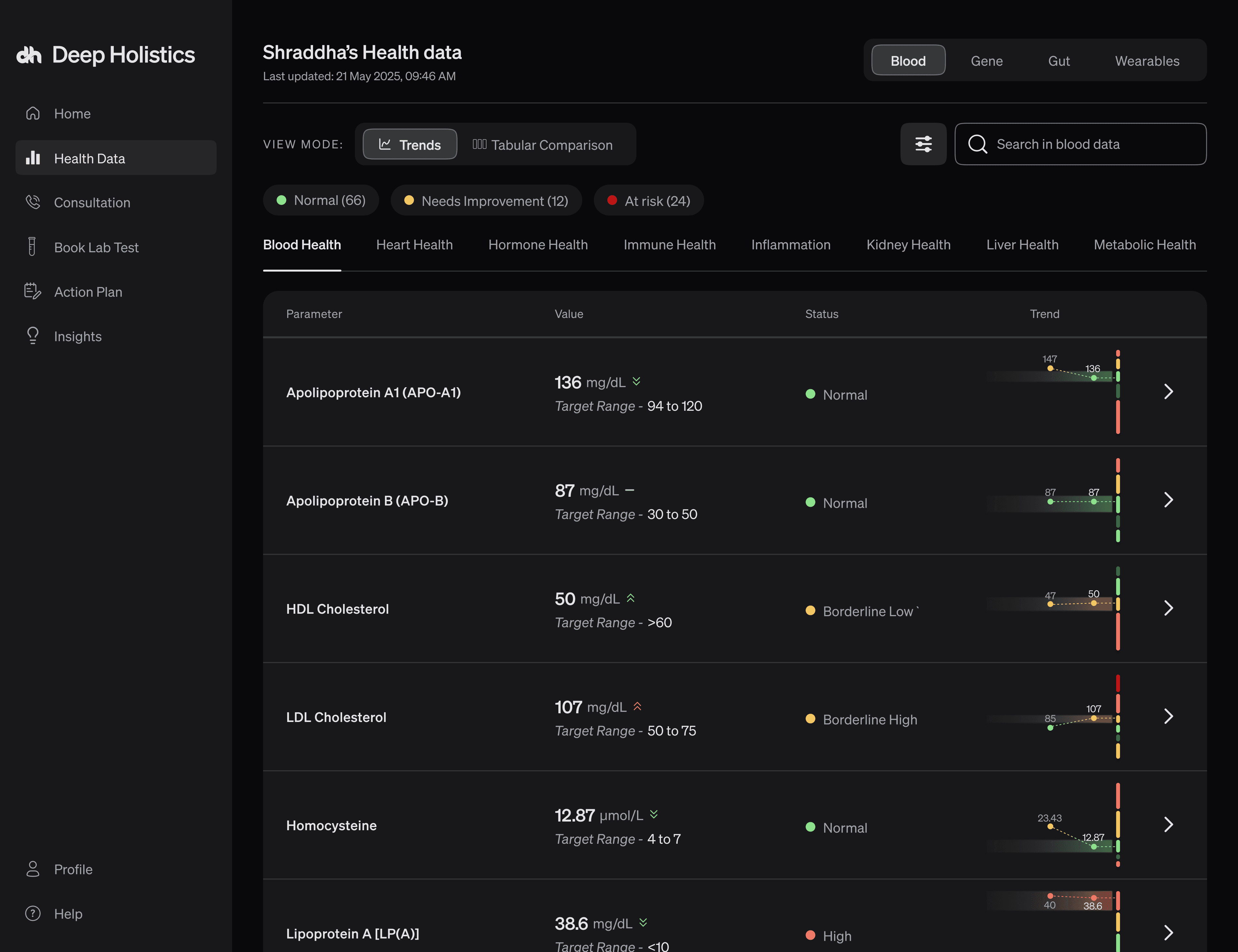
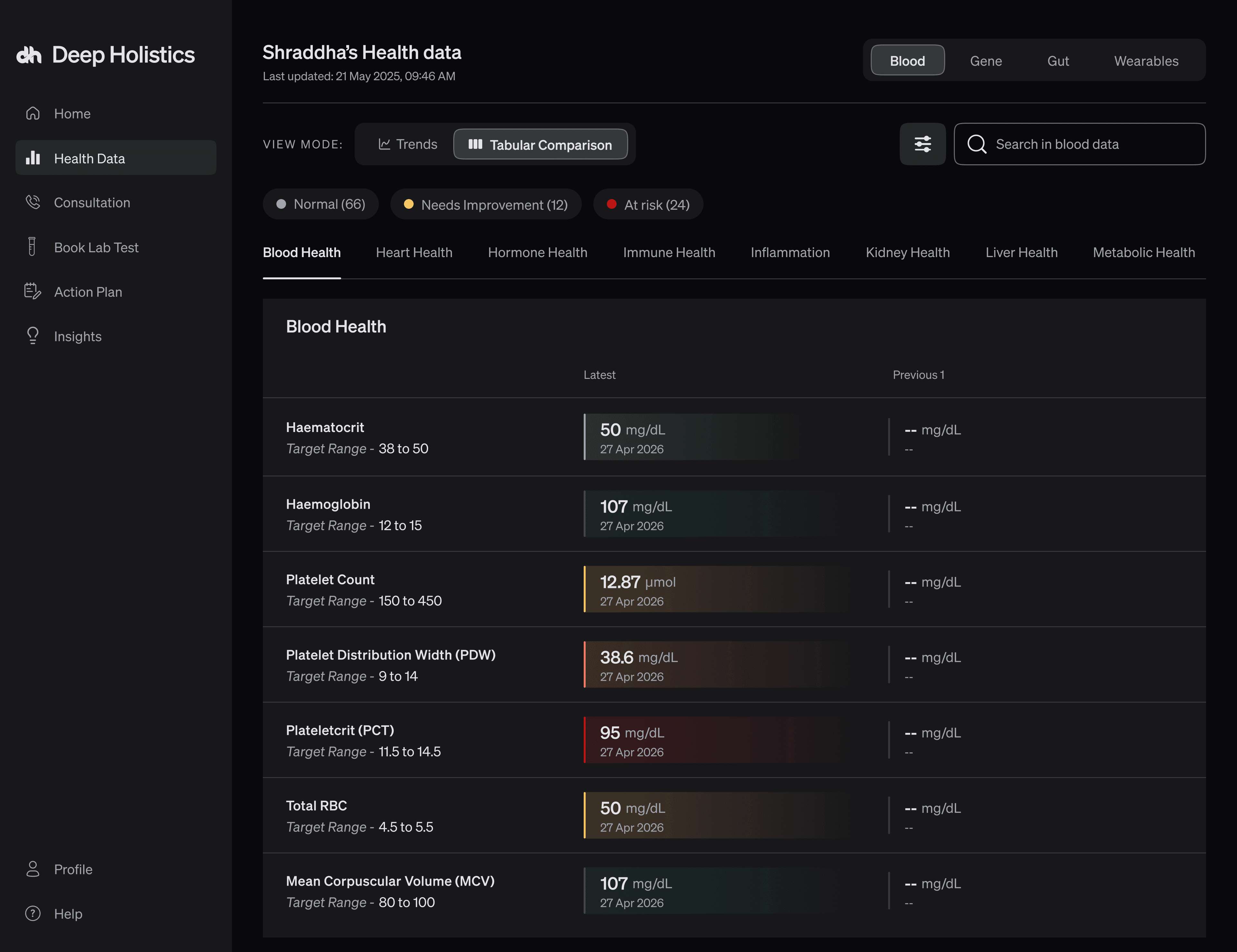
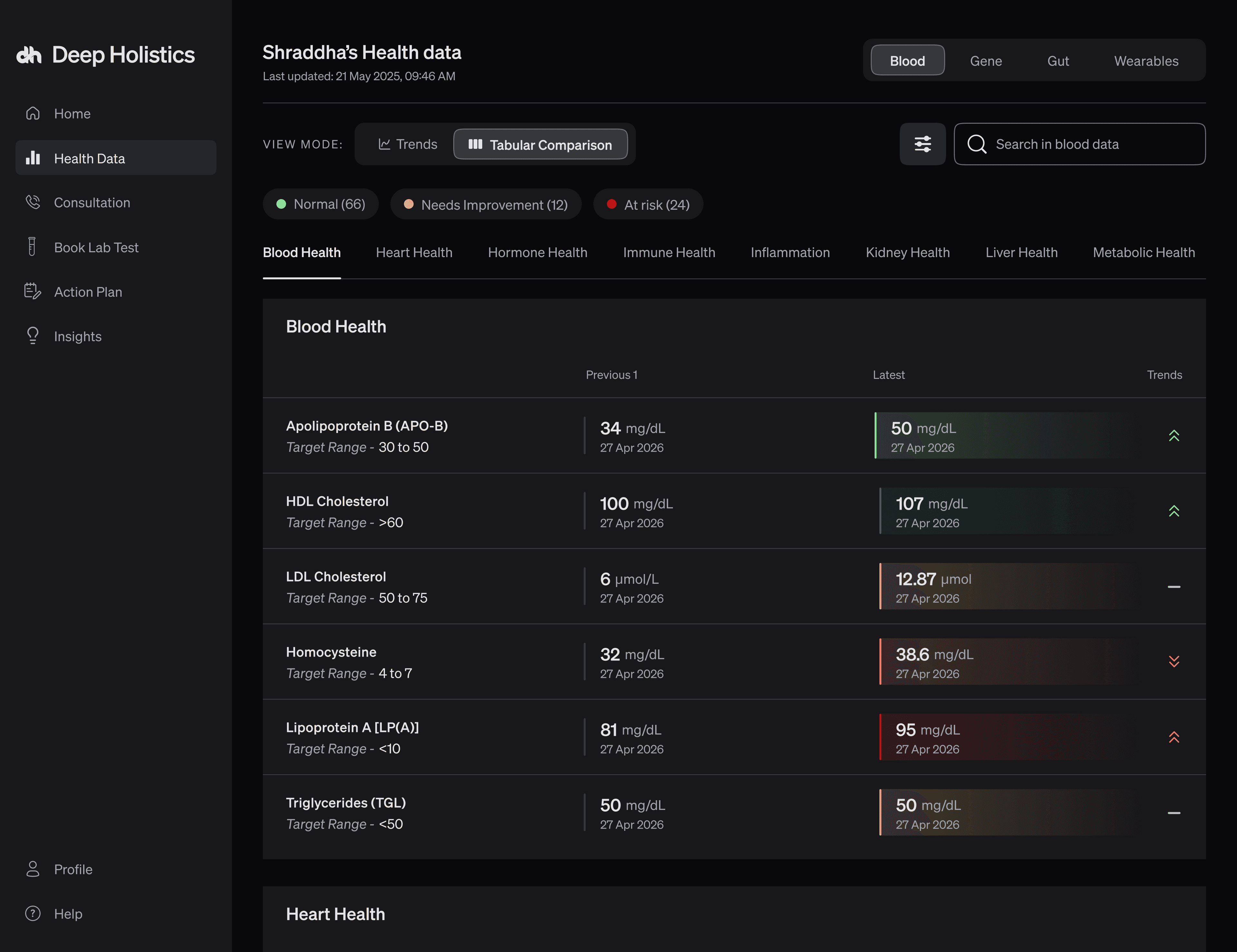

Customers stopped reaching out to the sales team just to understand what their results meant. The dashboard answered that for them
First time users could open 350+ biomarkers and actually know what they were looking at
Friend, Biohacker, and Doctor modes meant the dashboard could talk to very different people without watering anything down
Wellness experts stopped describing progress verbally on calls. They could just show it
Repeat customers could see exactly how their numbers had moved between tests, without hunting across separate reports
Grouping by severity felt logical until users couldn't tell which part of their body a marker belonged to
A hundred range bars are not the same as one range bar, even if the component is identical
Language is a design decision. How something is explained changes whether someone acts on it or ignores it

Health data is humbling to design for.
Designing this taught me that clarity is not a visual problem. It is a question of knowing what someone is actually trying to find out before they know how to ask for it.